Once again I find myself jumping back into the fray and helping a friend get Internet/phone/TV from Time Warner. Here is the offer:
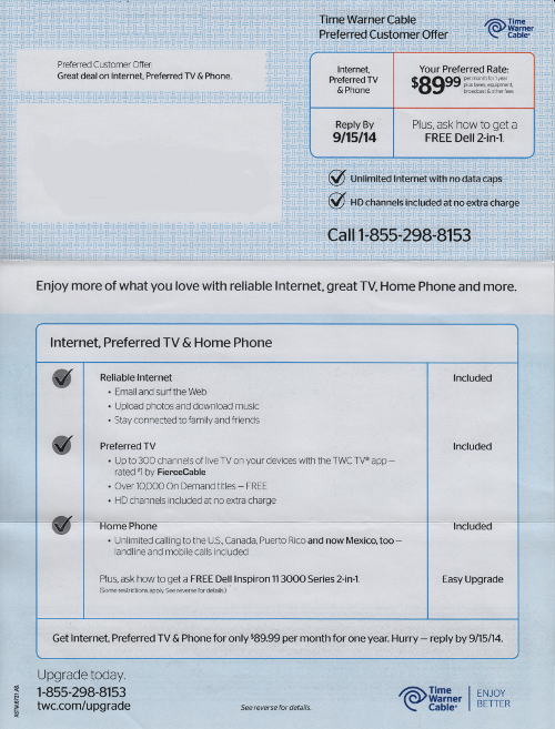
So, $89.99 per month for the first year. Not bad, right? Unfortunately, it comes to nearly $150 with equipment and taxes, but what can you do.
What bothers me is this bit at the bottom:
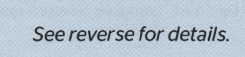
Do you want to guess what the reverse of the letter looks like?
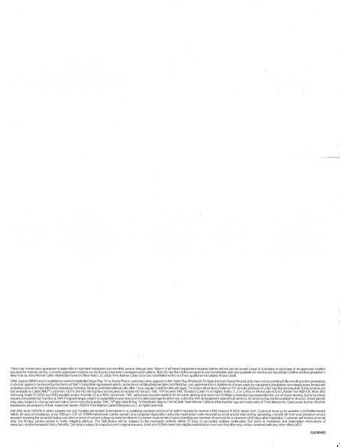
In the interest in transparency, would it have been too much trouble to use a larger font? I know there is probably some kind of design constraint that includes phrases like “negative space” that made you put the terms in teeny, tiny letters at the bottom of a mainly blank page, but it makes you look like you are hiding something.